National Bank of Oman (NBO): Annual Report
This layout celebrates NBO’s journey as a resilient, strong entity from the past to the dynamic times we live in now alongside Oman as a country. It highlights the idea of contrast to showcase this journey both in terms of the past and the present as well as NBO’s relationship to Oman, a country of contrasts, from the steadfastness of the mountains to the bustling metropolis, the vast desert to the flowing wadis and the intricacy of heritage to palpable modernity.
Sleeve & Cover
Visual Treatment
Visual Treatment
The visual treatment is ‘contrast’. Across all elements of the layout we focus on rich, bold colours from the NBO palette to represent its strength, while showing an interchange of colour to create a visual style that is bold and impactful
Treatment
A grey cover with a blue sleeve will be used with an emboss-deboss treatment.
Inside spreads
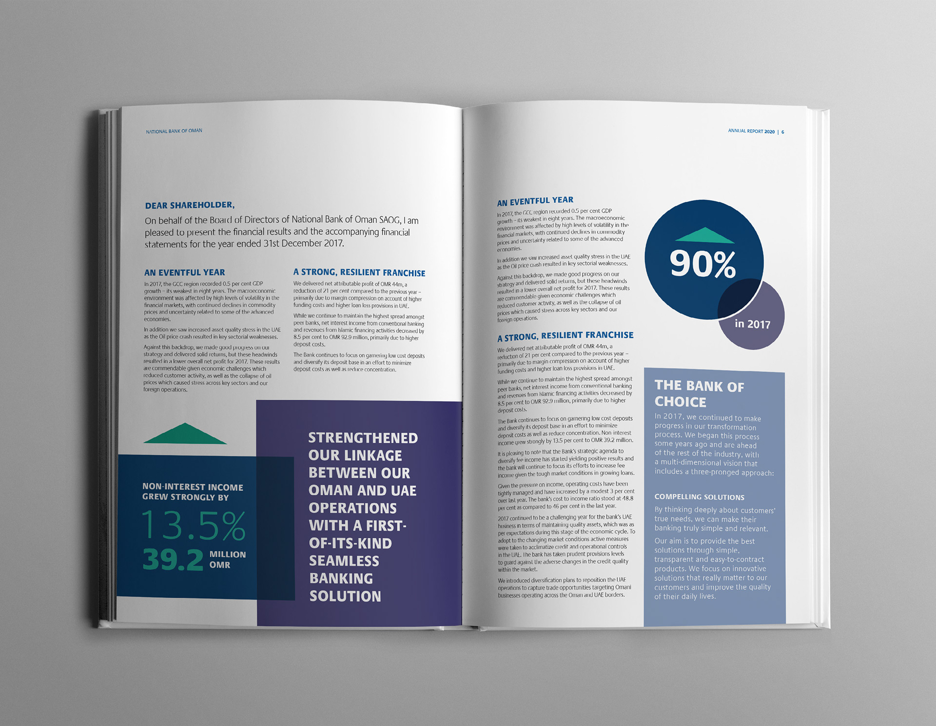
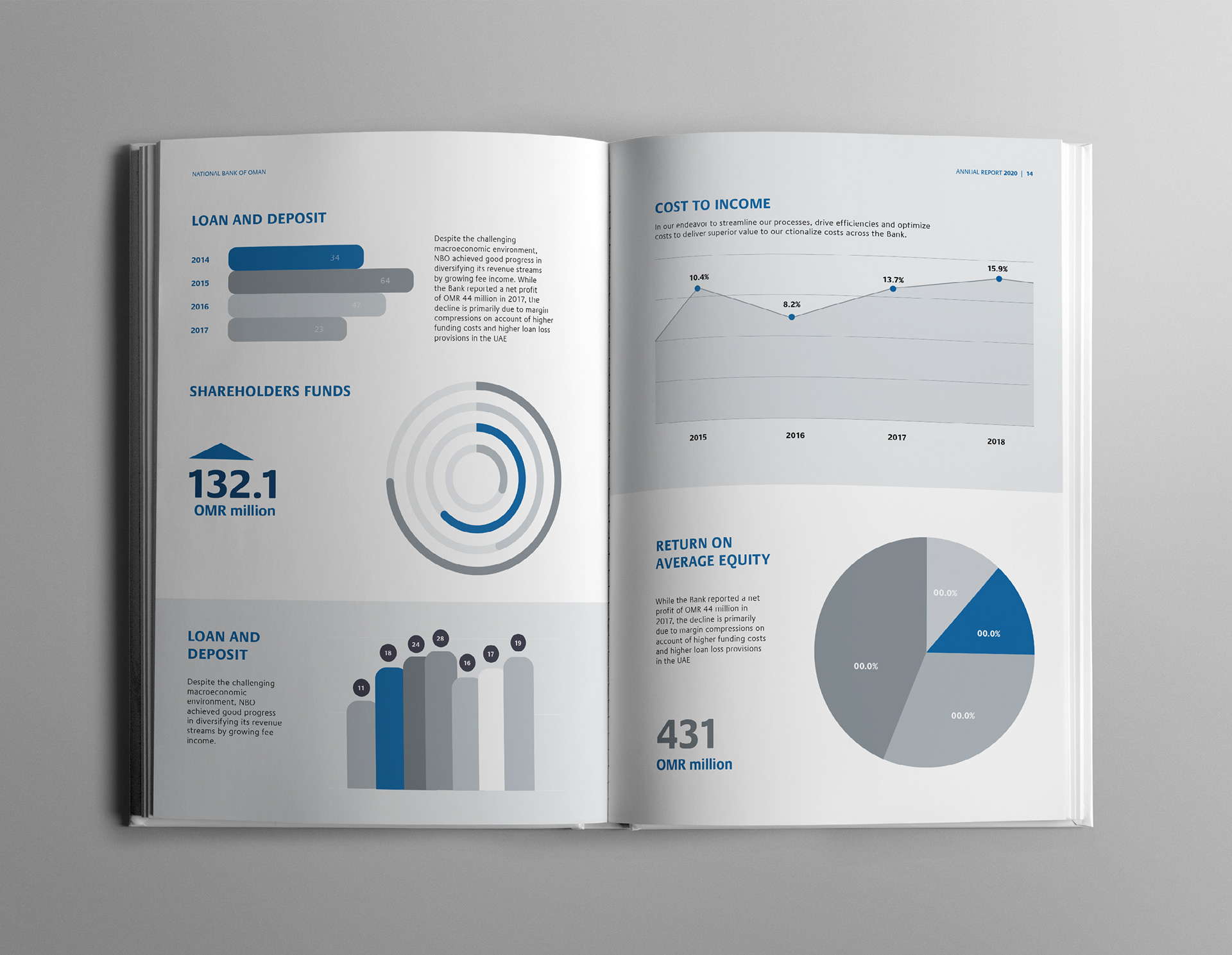
- Incorporation of colour blocking and filters for key messages breaks the monotony of content heavy sections.
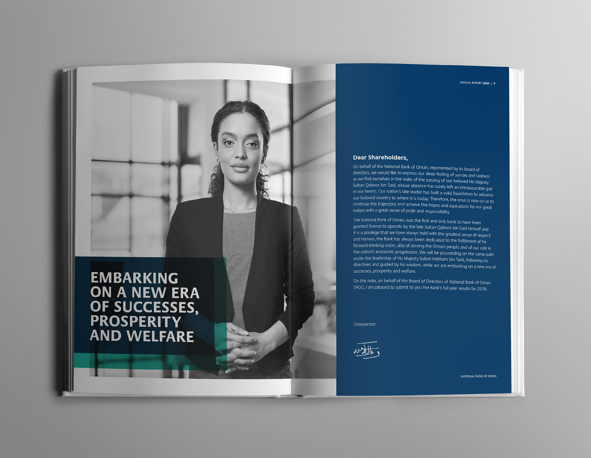
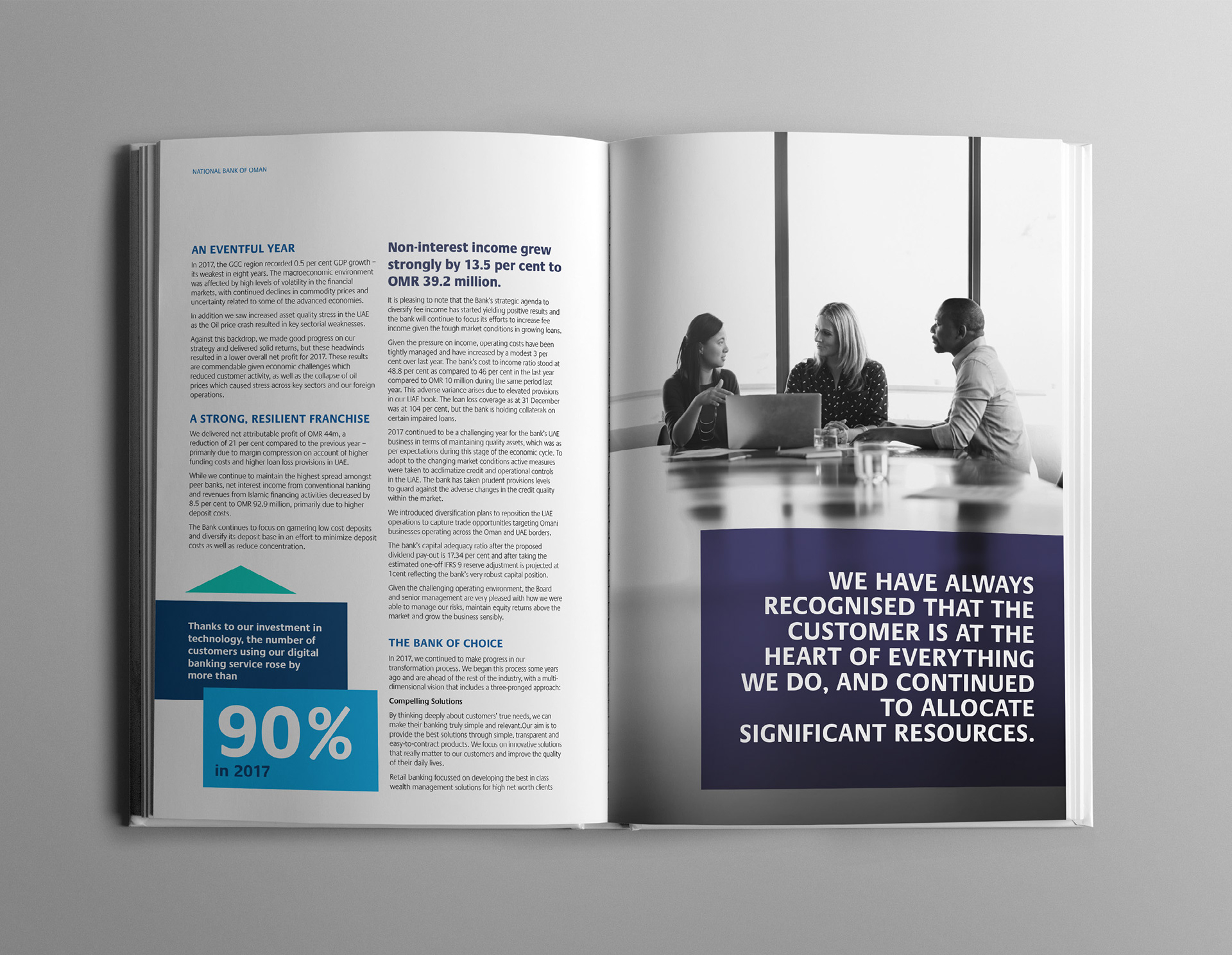
- The style of imagery across all sections are human centric.
- The style of imagery across all sections are human centric.
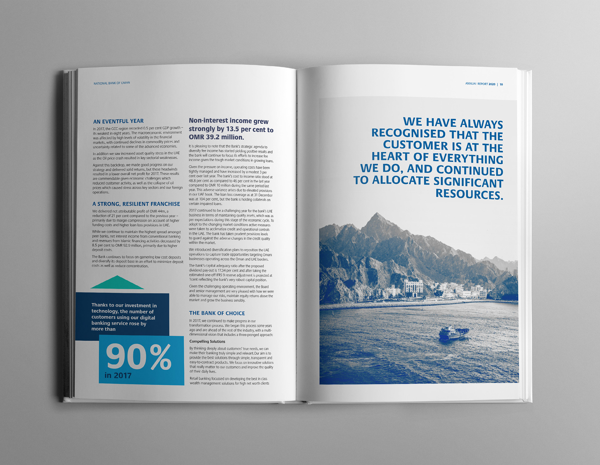
- Colour tone landscape imagery will also be used to break sections.
- On content heavy pages, the proposed colour filter overlap and contrasting palette enables key figures, statistics and data to be highlighted while providing visual breaks.
- Visual breaks are created in the report through the use of solid colour blocking device.
- Depending on the colour scheme of the section, an accent colour will be used against a monotone palette to create an impactful graphical style.